Product Design / UX Research / UI Systems / CRO / E-commerce Architecture
Doto — Scaling Conversion Across a VTEX E-commerce Ecosystem
Product design, CRO, and UX system evolution for Doto, improving high-impact shopping journeys through scalable VTEX components and continuous experimentation.
Client
Doto
Industry
E-commerce / Consumer Electronics
Location
Mexico City, Mexico
Year
2023–2024
Time frame
1 year 4 months
Role
Lead Product Designer
Engagement
In-house / Full-time
Platforms
VTEX Commerce / Responsive Web / Mobile Web / Android App WebView
Tools
Figma / FigJam / Jira / VTEX / GA4 / GTM / Google Search Console / Mixpanel / Looker Studio / Clarity / One Signal / Hotjar / MailChimp
Deliverables
Product Design Leadership
UX Research & Strategy
CRO & Experimentation
Design System
PLP & PDP Redesign
Cart & Checkout Flows
Self-Service Experiences
Responsive Prototypes
Design Reviews & Critiques
VTEX Component Library
Project overview
Doto was not a single redesign project. It was an ongoing product transformation across a fast-moving consumer electronics and e-commerce business.
As Lead Product Designer, I led two Product Designers while coordinating work across visual design, UX Research, UX Writing, SEO, marketing, product, and development.
The objective was consistently tied to CRO: identify friction, improve decision-making, test alternatives, and create reusable solutions capable of scaling across the commerce experience.
The work ranged from foundational interface systems to high-impact commercial features, with design decisions continuously challenged through research, behavioral analysis, Design Reviews, Design Critiques, prototyping, and experimentation.
Team: 2 Product Designers / 3 Designers / UX Writer / 2 SEO Specialists / UX Researcher / UI & Visual Designer / Project Coordination / Product / Marketing / Engineering
Building a Scalable Commerce System
One of the first challenges was creating enough consistency to move faster without turning every new initiative into an isolated redesign.
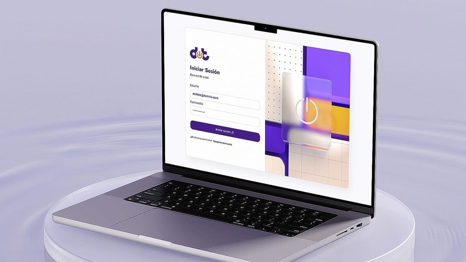
We rebuilt the digital interface around a system influenced by Material Design 3 principles and translated those foundations into Doto's internal VTEX component library.
Rather than treating the Design System as a visual inventory, we used it as commerce infrastructure.
Product cards, navigation patterns, filters, promotional modules, merchandising surfaces, transactional components, form states, and responsive behaviors had to support constant changes in catalog, campaigns, and commercial priorities.
This foundation allowed us to evolve PLPs, PDPs, checkout, category experiences, campaigns, and new services while maintaining a coherent product language across desktop and mobile.
Scaling Discovery, PLPs & Brand Experiences
A large part of the conversion opportunity happened before customers reached a Product Detail Page.
We redesigned Product Listing Pages around clearer filtering, merchandising hierarchy, reusable product cards, promotional modules, and responsive layouts.
Product cards had to accommodate different combinations of pricing, discounts, financing, ratings, colors, storage, specifications, badges, and promotional states without losing consistency.
We also developed category interstitials to improve navigation across large product families and dedicated brand experiences that gave manufacturers greater visual expression without breaking Doto's underlying commerce architecture.
The same system extended into featured promotions, related products, best sellers, brand discovery, recommendations, and the minicart.
The objective was to improve product discovery and merchandising while maintaining an architecture modular enough to respond to constant catalog and commercial campaign changes.
Turning the PDP Into a Decision-Making System
The Product Detail Page became one of the most important experimentation surfaces in the product.
Instead of treating it as a static product description, we designed it as a decision system capable of answering the questions that directly affect purchase intent:
• Is this the best price?
• When will it arrive?
• Is there a cheaper alternative?
• Can I finance it?
• Is there a refurbished version?
• Can I protect the purchase?
New modules introduced price history, price-change alerts, delivery estimates, extended warranties, protection products, financing alternatives, contextual promotions, recommendations, and comparison mechanisms around the core purchase action.
The goal was not to add information for its own sake.
Every module had to clarify value, reduce uncertainty, or create a commercially meaningful path forward.
Giving Users Better Ways to Compare Value
Consumer electronics purchases are rarely evaluated in isolation.
Customers compare price, specifications, financing, brands, availability, and alternative products before committing.
We introduced comparison tools directly into the shopping experience instead of forcing customers to leave Doto to complete that research.
The price comparator contextualized Doto's offer against other marketplaces while exposing differences in price and supported payment methods.
Product comparison translated dense technical specifications into a structured side-by-side format.
Frequently bought together added another layer of contextual merchandising by connecting products that made sense as a purchase group.
Together, these modules moved the experience from simply presenting products toward actively supporting purchase decisions.
Turning a Logistics Constraint Into a Customer Choice
Doto could offer selected products through two different fulfillment models.
• One option delivered faster at a higher price.
• The other reduced the price but required a longer wait.
Operationally, both alternatives already existed.
The Product Design challenge was translating that logistics complexity into a choice customers could confidently understand.
We explored multiple versions of the component across desktop and mobile, changing hierarchy, terminology, selectors, delivery information, tooltips, price emphasis, postal-code behavior, CTAs, quantities, and sticky states.
The component was not treated as a one-time redesign.
Different representations of the same decision were developed and tested to understand which one communicated the trade-off between saving money and saving time most effectively.
Conversion increased 19.48% for products using the Double BuyBox component. Interaction with general products increased 15.27%, site visibility increased 27.21%, and average visits from returning users increased 25.6%. VTEX reported the results from continuous testing periods lasting between 6 and 9 days.
Results
- +19.48% Conversion on products using Double BuyBox
- +15.27% Interaction with general products
- +27.21% Site visibility
- +25.6% Average visits from returning users
Designing Through Experimentation
Our process combined qualitative research, quantitative signals, prototypes, usability validation, behavioral analysis, and controlled experiments.
Rather than limiting validation to an A and B solution, the team frequently explored A/B/C/D alternatives in parallel.
Design Reviews and Design Critiques became part of the operating model. Each iteration was challenged from the perspectives of clarity, customer value, business impact, technical feasibility, responsive behavior, accessibility, and conversion potential before reaching experimentation.
The process worked as a continuous feedback loop:
Research → Hypothesis → Variants → Critique → Test → Measure → Iterate
This allowed important product decisions to evolve from evidence rather than individual preference.
Expanding the Business Beyond the Core Product
CRO was not limited to improving the primary product purchase.
We also designed ways to extend customer value around it.
Refurbished and pre-owned products created a lower-price alternative within the same customer context, requiring a clear explanation of product condition, savings, warranty, ratings, and purchase implications.
Instead of separating refurbished inventory from the main commerce experience, we connected relevant alternatives directly to new products.
Protection products followed the same principle.
Extended warranties, accidental-damage protection, and other coverage options needed to communicate complex services without interrupting the purchase journey or creating uncertainty about what customers were buying.
These projects required a balance between commercial opportunity and customer trust.
An add-on only creates value when customers clearly understand what they are purchasing and why it may be relevant.
Building Trust Through Cart, Checkout & Payments
The buying experience had to remain understandable even as payments, financing, fulfillment, and optional services became more complex.
We redesigned cart and checkout surfaces around clearer order summaries, delivery alternatives, optional protection, DotoFon cross-selling, promotional states, financing, and different payment methods.
The platform needed to support multiple financial services and payment partners without making the journey feel fragmented.
That required clearly communicating what had been selected, how much the customer would pay, how the purchase would be delivered, and what would happen after continuing.
We also worked on payment experiences where parts of the transaction could continue through external financial ecosystems, including integrations related to Banco Azteca.
Checkout was therefore treated as more than a form.
It was the final stage of a decision system that had begun much earlier in the shopping journey.
Designing the Full Customer Lifecycle
A significant part of the work happened outside traditional shopping screens.
Customer feedback revealed recurring friction around order status, cancellations, shipping updates, refunds, warranties, returns, billing, personal data, DotoCash, and account management.
These were high-friction moments where unclear information could translate directly into customer-support dependency.
We redesigned these experiences around self-service.
The work included clearer status communication, explicit next steps, reusable forms, validation states, product selection, eligibility logic, success and error states, and policies adapted to different product conditions.
Post-purchase experiences were also expanded to connect order confirmation, payment, collection, shipping, delivery, reviews, and recommendations.
The objective was simple:
Help customers understand what is happening and what they can do next without forcing them to ask someone else.
Designing New Revenue Experiences Inside the Ecosystem
The same product architecture also had to support entirely new lines of business.
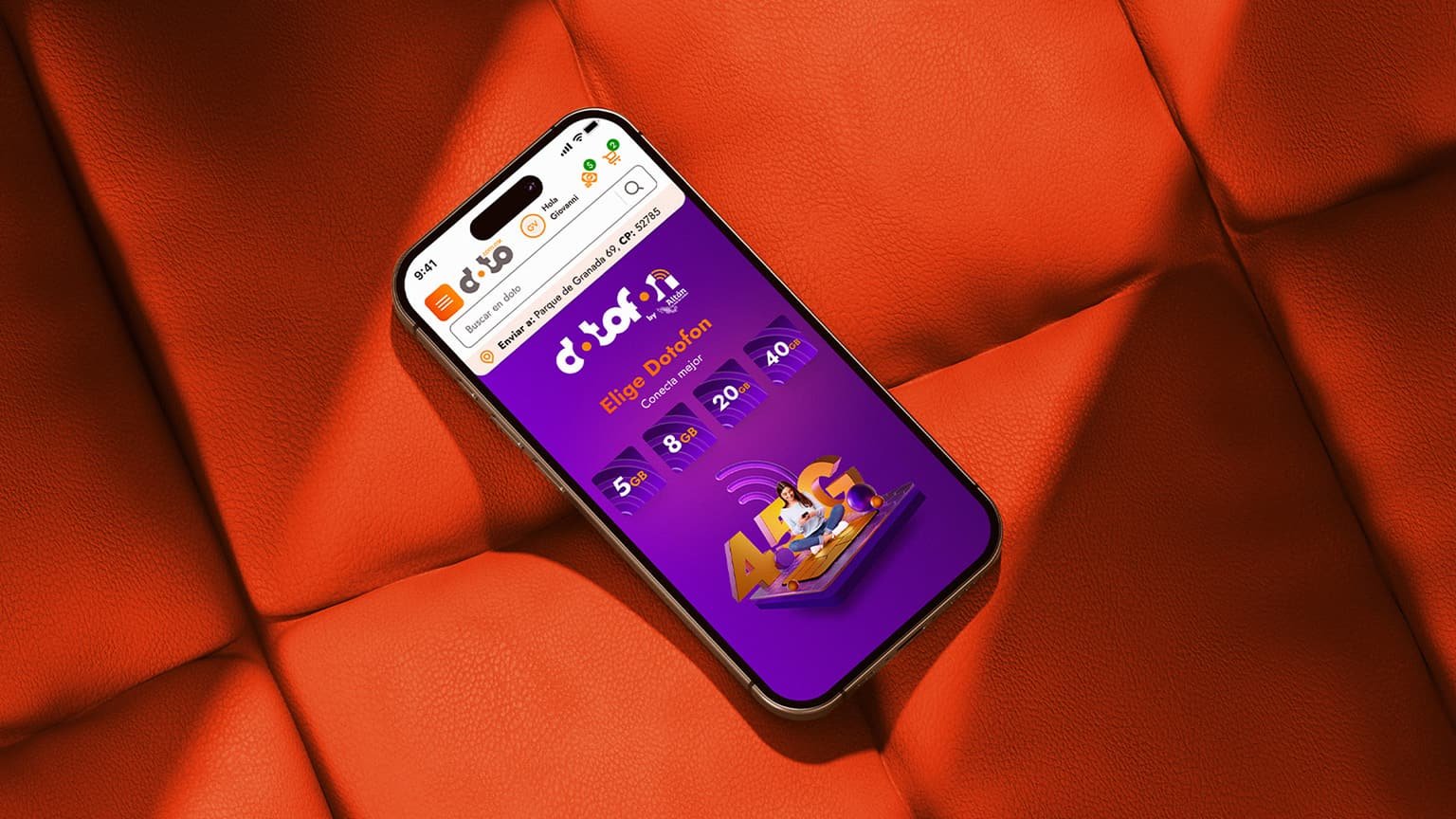
DotoFon introduced telecommunications into an e-commerce experience originally centered on consumer electronics.
Designing DotoFon required far more than creating a landing page.
Plans, contract periods, product cards, PDPs, portability, SIM activation concepts, recharge information, FAQs, promotional modules, progressive disclosure, and contextual cross-selling all had to coexist with Doto's existing customer journey.
We designed the service across acquisition and commerce touchpoints while giving it its own visual personality and connecting it with other parts of the ecosystem such as DotoCash and DotoExpress.
The project demonstrated the flexibility of the underlying product architecture.
A new business model could be introduced without rebuilding the entire customer experience from scratch.
From Interface Design to a Product Design Practice
The most important outcome of my time at Doto was not a single screen. It was helping establish a more systematic way of designing commerce.
We connected product decisions with research, conversion goals, customer feedback, technical constraints, Design Systems, experimentation, and continuous critique.
The work covered discovery, merchandising, PLPs, PDPs, payments, checkout, services, post-purchase, and new business lines rather than optimizing isolated moments.
As Lead Product Designer, my responsibility was to create the conditions for that work to happen consistently:
lead the Product Designers on my team, coordinate with specialized disciplines, challenge assumptions, prioritize high-impact opportunities, and keep design connected to measurable business objectives.
The experience reinforced a principle that still guides my work: Good e-commerce design does not remove complexity from the business. It translates that complexity into decisions customers can understand and act on.
The work developed during this period also created visibility beyond Doto and later became one of the reasons I was approached to work on the Gandhi e-commerce experience.
Acknowledgements
This work was made possible by a multidisciplinary team across Product Design, UX Research, UX Writing, Visual Design, Product, and Engineering.
Special thanks to:
- Jacobo Sutton (CEO)
- Danilo Smith (Product Designer)
- Teresa Solís (UX Research)
- Estefanía Hernández (UX Research)
- Karen Rangel (Branding & Visual Design)
- Catherine Quiróz (UX Writing)
- Marco Hugo Reyes Larios (CTO)
- Eder Hernández Avedaño (Front-End Development)
for their collaboration throughout the evolution of Doto's digital ecosystem.